Pinterest Was A Pivot From Mobile, With Funding in 2009

HelloTote was an iPhone app by Cold Brew Labs, the parent company of Pinterest.com.

I’m surprised that articles on Pinterest in Fortune and Business Week start the story with the launch of the Pinterest.com beta launch in early 2010.  The story really starts in 2009 with a mobile app and seed funding.

The holding company for Pinterest.com, Cold Brew Labs, was incorporated in 2008. One of the company’s first plans was to launch a mobile shopping app called HelloTote.  According to the SEC, Cold Brew Labs raised over $500,000 in July 2009 from investors.  I know this round included included the venture capital firm Firstmark.

HelloTote's Facebook group page, which has pictures of Pinterest.com founders Paul Sciarra and Ben Silbermann, mentions using the app to save favorites.

According to its Facebook page, HelloTote was intended to be a “shopping catalog for the iPhone” where “you can browse items from dozens of retailers, save favorites, get sale notifications, and find nearby stores.”  The first version “…has women’s clothing, shoes, and accessories from stores like Nordstrom’s, Saks, Banana Republic, Shopbop, and J. Crew.”

Fortune must have been mistaken when they write that the Pinterest team was “hard up for cash” in January 2010, just 6 months after closing $500,000.  The small Cold Brew Labs team raised an additional $700,000 – $1,000,000 in November 2010, suggesting they were ran lean but never that close to bankruptcy.

Did you like this? Share it:
Share

Steal Your Story Before Someone Else Does

Nick O’Neil does a great job explaining how Forbes.com captured 680,000 page views by posting a summary of a long article that appeared in The New York Times.  And nearly every day, websites are summarizing articles and interviews that appear on other news sources.

Today, I was surprised to see The Wall Street Journal blog it’s own article about  KeepRecipes.com.  Upon reflection, I think this might be a great idea for news sites that do long form journalism.

Google search results now show up to 4 articles from the same domain.  So, the publisher can aim for all 4, or at least the top 2, which get the overwhelming majority of clicks.

If the publisher is big enough to get shares and links for both the blog post and summary, and has a high page rank, it will likely get the top 2 search results.  The primary negative of having both an long form article and a blog post is that the blog post could steal some inbound links, social mentions, and comments from the long form article, hurting is ranking in Google search results.

However, the publisher can not only get two listings but also cater to two audiences–(1) those who want a summary; and, (2) those who want long form research.  I personally never use cnn.com because the “story highlights” bullet points make me feel silly.  And I don’t like Huffington Post because it often summarizes news elsewhere, which I then have to go read.  But the idea of a trusted source doing a summary and a long form makes a lot of sense to me.

Interestingly, the blog post on the WSJ has a better ranking in Google, perhaps because its link structure includes keywords.  Most importantly, the blog article and the original article appear in the results above an article that mostly summarizes the original piece (though I must thank them for a kind summary and link).

Should news outlets blog and summarize their own articles?

Did you like this? Share it:
Share

Delight Frequency vs Delight Depth

A friend in the VC community asked me to evaluate a mobile wishlist and deal finder.  Interestingly, that’s what SF darling Pinterest first raised money for with HelloTote.

I advised my friend to focus on how deeply and frequently consumers get delighted by the product.

  • Low delight, high frequency products offer a user low levels of delight daily. Facebook, Instagram, YouTube and Zynga are great examples.
  • High delight,  low frequency products offer delight a handful of times each year.  RentTheRunway and Fab.com acted upon 50% off deals fall in this category.

If your product doesn’t offer over 50% off, you need to make sure it can deliver delight often. Delight can come in many forms:

* Getting a comment from friend and feeling a sense of connection

* Earning a badge and getting a sense of accomplishment

* Learning something

* Getting a laugh

* Showing something cool

What you don’t want to offer is a few dollars of savings or a few comments from friends a few times a year.  That is what a comparison search engine or mobile shopping tool might do.  Web comparison search engines like Shopping.com and Kayak.com need to invest heavily in advertising and search engine optimization because their product delivers only moderate savings and delight.  They struggle with retention.  A mobile app has an even more difficult time with retention because intent-based marketing opportunities like Search Engine Marketing on the web are immature on mobile.

And, of course, the deeper the delight you provide the more you can charge a consumer.

What impresses me about BirchBox is that they’re doing everything with their community, points, deals, instructional videos, and personality.

On the other hand, I fear Foursquare doesn’t offer quite enough delight beyond just badges with their low levels of interaction among the community and low monetary rewards.

Lastly, “time until first delight” is a metric that will drive retention and virality.  A wishlist and deal finder can  struggle to make a user delighted on their first visit.  On the other hand, a social site the lets a user interact with a friend or earn a badge, or a daily deal sites can offer 50% off, can do much better on offering some delight over the first 30 days.

How often do your favorite products delight you? Where to they fall on the chart?

Did you like this? Share it:
Share

8 Ways FarmVille Designs for Engagement

Earlier this week John Doerr, an investor in Google, Amazon, and Intuit, said Zynga is the fastest growing venture he’s ever been a part of.  Zynga’s flagship game, FarmVille, has 3 times the reach of Twitter. FarmVille has 71 million active users while Twitter has around 22 million active users (Twitter has 110 million registered users, of which an estimated 20% are likely active).  Perhaps more impressively, Zynga is estimated to generate $50 million in revenue from the most engaged members who buy virtual goods and keep up a toolbar.

Every web experience designer can learn from the tactics deployed in FarmVille to engage members over the long term. Here are 8 tactics you should include:

1. Reward users for returning in a short time period. Every website visitor is going to leave at some point. But why will they return in 24 hours? FarmVille is centered around planting and harvesting crops. The shortest time a new user can harvest a crop in is 4 hours. So on the first experience, FarmVille says: “Go away and come back in 4 hours”. How bold! In order to make progress in FarmVille, you need to go and come back. The site also has functionality that you can only use once per day (e.g., giving gifts to friends), further encouraging you to go and come back.

Come back to Harvest!

2. Reward users for helping friends every day. When you give a gift to a friend on FarmVille, it actually benefits you. Fertilizing a friends’ crops does not cost you cash. Instead, it raises your experience level. So, you can feel good about both helping someone else and gaining points at the same time. Dropbox.com does something similar with their program for inviting friends that gives both the inviter and recipient extra space. But on FarmVille, you can earn coins and give gifts every day you visit a friends’ farm.

Help friends with a click, and earn points

3. Allow users to create without typing. FarmVille is incredibly easy to play–you just point and click. Click to till soil. Click to plant seeds. Click to harvest. It can be played by 5 year olds, drunk college kids, or tired parents. You never need to think about what to say, how to spell, or what key does what. Perhaps most importantly, it can be played by the user whether they have 5 minutes free (i.e., to harvest crops) or 30 minutes free (i.e, to redecorate their farm).

4. Show progress…everywhere…on everything. It seems like everywhere I look in FarmVille there are progress bars implying future levels of achievement can be obtained. If it’s an activity you can do on FarmVille, it’s measured somehow with coins, cash, points, levels, ribbons, and more. This make’s users aware of the value of their past actions.  It also suggests what the next step can be.

Top Progress Bar

Ribbon Progress

5. Make users feel lonely without friends–because if they get friends on, they’ll stay longer. After spending a few minutes clicking around FarmVille, you quickly see the game is designed for you to have friends. The main screen has at least 10 reminders of where your friends should be. These serve as a call to action to add friends. And you’re more likely to stay engaged if you have friends involved. FriendFeed claimed that, for their service, a new user is much more likely to stay active if they have 5 friends.

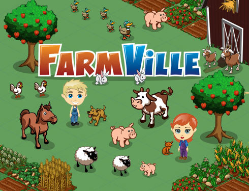
6. Enable self expression. FarmVille immediately lets you customize your avatar and start to customize your farm. You can represent yourself with just a few clicks of the mouse. And by making a representation of yourself, it’s likely you’ll care about it. Do you want to be the person who has withered crops or a small farm?

Customize your avatar...with a click

7. Offer increasing levels of complexity for mastery. After playing FarmVille for a bit, they started to unlock new things that cluttered my display. For example, after a week of play did I get a “gas meter” for a “Tractor”. I expect that if I keep playing they’ll be more and more things to unlock that can be mastered. [Editors note:  I've now heard that "horse trading" is something veterans can do]

8. Have surprises & limited time events. Sometimes when you plow a plot of land, you find coins. Sometimes when you log in, there will be a special promotion for a limited time stuff to buy.  These surprises make it fun and encourage repeat visits.  Even Google changes up it’s logo every now and then just to keep things fresh. I’m so curious about what FarmVille will think of next that I’m sure I’ll regularly stop by in the coming year.

Limited Edition Items

In summary, FarmVille is designed to retain users over the long run.  There is a lot that designers of websites can learn from the tactics deployed.  To hear about follow up posts on how FarmVille acquires users and monetizes, follow me on Twitter.


What do you think?  What else does FarmVille do well?  Will they still have more active users than Twitter in 2 years?

Did you like this? Share it:
Share

The One Privacy Setting Facebook Forgot

Have you adjusted your privacy settings in 5 different places?  If not, your friends may be sharing your Facebook pictures, status updates, religious views and more.  Preventing your information from being used  across the web requires:

  • Visiting  Facebook’s settings for “What your friends can share about you”
  • Visiting  Facebook’s settings for “Instant Personalization”
  • Visiting Yelp
  • Visiting Microsoft Docs
  • Visiting Pandora

Instead of requiring 5 steps (a quintuple opt out!), Facebook should offer one setting, which allows you to easily opt out of sharing your data unless you give permission.

It seems like every year Facebook automatically ensures its members share more data with the world.  In 2007, Facebook Beacon automatically shared what members bought, without their permission.  In 2009 new privacy settings automatically defaulted most members information to the public.  Now, Facebook is looking to your friends to make your data public.  Senator Schumer is being polite when he says, “This opt out procedure is confusing, unclear, and you might even say hidden”.

It might be acceptable if this was the only place where you had to go to opt out of sharing:

Facebook privacy setting

In the image above, you’ll see the top privacy setting area is for your personal information.  However, there are now more privacy settings that control where your personal information gets shared. The settings below are not located in “Personal information and Posts”–they’re in “Applications and Websites”.

Facebook privacy setting

In fact, after exploring all the options above, in “Applications and Websites” area, I came across these settings for “Instant Personalization”:

Facebook privacy setting

I thought I’d click to “Learn More”.  That led to a long list of Q&A, where I found this:

Facebook privacy setting

So, it turns out that to ensure my past comments and pictures stay private, I need to visit each “instant personalization partner” of Facebook and opt out.  After doing some research, the Electronic Frontier Foundation confirms that only way to fully opt out of Instant Personalization is to take all these steps.  If you don’t take all these steps, your friends may unknowingly share all your past activity on Facebook.

Facebook says it requires Yelp, Microsoft and Pandora offer “an easy and prominent method for users to opt out”.   It would be nice if Facebook took its own medicine.  Here is a proposed privacy setting:

Proposed Facebook Privacy Setting

Facebook could define partners as applications, advertisers, and third party websites. They could offer more detailed options.  But the general idea is to make it a double opt-in system (1. you say you’ll share, 2. you say which partners to share to) rather than a quintuple opt-out system.

What do you think?  Should Facebook offer one easy and prominent method to opt out of sharing?

Did you like this? Share it:
Share

I’m not writing an obituary for the professional critic

I’m a huge fan of some of my friends’ blogsmulti platform blogs, and websites that rely on the wisdom of their users.

As many blogs and community sites feature reviews, some say the professional critic is dying.  For example, in The New York Times, Professor Randall Stross writes:

“Like others, I used to rely on professional critics for guidance in many domains — restaurants, movies, books……sites that welcome customer reviews have evolved significantly….dedicated reviewers produce work that, in quantity and quality, increasingly approaches that of their professional forebears….”

I certainly agree with Professor Stross that professionals will never produce the same quantity of content as a community.  Wikipedia has millions more entries than other encyclopedias.  And having some reviews available for the local sandwich shop is better than none, so there is value in quantity.

But the increasing availability of great content online does not mean the decline of the professional critic.

Before the internet, how many people were reading Ruth Reichl’s restaurant reviews in the New York Times print edition, and how many are now reading Frank Bruni’s print reviews and online blog?  How many people used to read or watch Siskel and Ebert, and how many now read or watch or post online to Ebert?

Continue reading

Did you like this? Share it:
Share